I started at Vanquis in April 2018. It took me until March 2020 to convince the bank that we needed to invest in new technologies so that we could succeed in our goal of being a customer champion and digital first bank. This case study is specific to the Alpha release of the app and its associated back-end technologies.
Update: January 2022. Large scale testing of the MVP with customers who use assistive digital technologies, or are considered temporarily or permanently vulnerable, has concluded with the app scoring between 4.7 and 5 out of 5 across all test areas. Testing was carried out by independent Cognitive Psychologists with real customers.
Update 2: April 2022: The MVP is now being used by our beta testing group. The new app is consistently scoring high on each of our key UX metrics. Average scores of 4.4 to 4.8 out of 5 for UX and UI. The next phase is to create feature parity with the old app using a new and real-time back-end before switching off the old app. This is due to go live in late 2023.
As always, this project began with customer insight. My team interviews customers most weeks, and as of October 2021 we'd had face to face hour long conversations with over 400. We also survey our customers, and have had responses from ~500k so far.
Everything we were hearing and seeing was pointing to the need to create a radically simpler banking app. Something that uses an almost brutalist approach to minimalist design. Customers wanted something approachable, but felt that the current trend of 'fun' and 'best friends' was disingenuous.
We gave ourselves time to play - to see what happens if we design an app without constraints, based only on customer need, and without the constraints of a strong brand. The results were interesting.
Some of the early concepts. The shocking victory of the bottom middle test led us down a purely typographic route,
Starting with our gut feeling and then iterating with customers in the room, we went through 8 different design languages before we finally arrived at one that seemed to get universal buy in with our customers.
Bumblepuppy - the first design language that resonated as intended with all our test customers. It didn't work strategically though. As the bank started to offer more products, and the humanist content would hide some uncomfortable truths about account states, we decided to retire it.
In our testing sessions we found that bold use of type, space, and colour, gave rise to a clarity that was absent in the finance sector. The popular graphics and charts, the obsession with filling every part of the screen, these make most banking apps difficult to consume.
This is especially true if you have a visual impairment, dyslexia, or high levels of anxiety. The combination of the language used, the complexity of the subject, the natural stresses that result when dealing with money, and the information overload present in digital first services means more people make more mistakes whilst rushing to make decisions without fully understanding what they are doing.
We found this carried over to the UX on offer in banking apps, where brutal reductionist thinking and absolute focus on customer need was often ignored in favour of high brand moments, and return on investment.
We started to understand that this small app experiment was a way to surface the larger changes the bank needed to make in order to better meet the demands of it's customers.
Twin Tip Experiment 1 - created with customers in the room in January 2020.
From here we defined our design philosophy: useful simplicity.
Every feature, every component, every part of every screen must earn it's place. We strive for absolute simplicity and clarity in everything we do; in the user interface, in the user experience, and in the content.
And from here we arrived at Twin Tip - a fresh, simple, and focussed design language that puts customer need ahead of brand.
The content hierarchy on the app is based entirely around the Procedural Knowledge our customers demonstrate, both in testing and existing behaviour. They want to know how much they owe, how much they can spend, and if there is anything they need to be aware of. In that specific order.
The top half of the app provides context to the lower half, which shows information in three states: things to note, things to action, things that can't be ignored.
Although not shown here (yet) the app supports multiple products, multiple account owners, and the ability to adapt to accessibility and vulnerability needs. It also uses design tokens to enable user interface changes to be dynamically applied to the app directly by the design team.
Scaling with design systems.
We have over 3400 different devices accessing our app, with hundreds of different screen sizes and aspect ratios. The app contains hundreds of screen combinations depending upon the account state and the products the customer has access to. We also adapt every screen for users of assistive digital technology, as well as changing content and flows to meet the needs of more vulnerable customers.
The common method of scaling design at the full page level, or having a set of breakpoints, struggles to keep up in real contexts. Add to this the complex needs of accessibility and vulnerability and a traditional design approach is no longer practical. Below you can see the same screen on just one device, adapting to meet a variety of needs.
The way we are solving this challenge is to create a channel-wide design system. A set of components, patterns, and rules that make designing for all these devices and all these channels easier and faster.
You could read more about the design system here: https://andrewlarking.co.uk/stitch-multi-brand-inclusive-design-system
Iterating with customer feedback.
With the first release of the app in people's hands, we are now focussed on iteration and improvement. The Alpha app uses lift and shift UX in order to speed up delivery, but with our new back-end capabilities we are now able to redefine every journey we offer across the group. From log in to payments to collections to helping people who've experienced financial abuse, every feature on the new app is being redefined and re designed from a fresh stance. And we're starting with the most difficult - customers who are in financial difficulty.
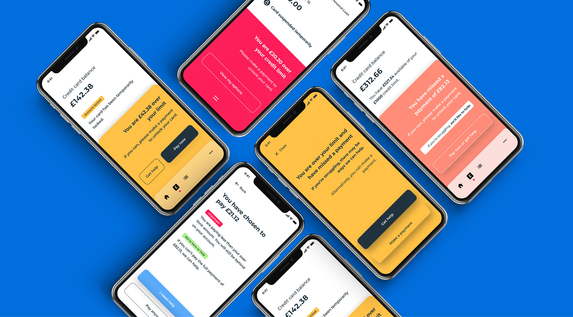
Depending upon the customer and their situation, we've found that adapting colour and tone of voice can have a profound impact on ensuring the customer lets us know they are in difficulty instead of just vanishing.
We use progressive disclosure on our messaging so that urgency increases over time, instead of hitting hard in one go. We can only do this now because we've had the opportunity to redesign the collections journey entirely. The impact is that instead of 84% of customers entering into a longer term collections state after one missed payment, testing suggests we would now see less than 20% of customers entering long term collections. This is a massive win and was achieved with nothing more than colours and words.