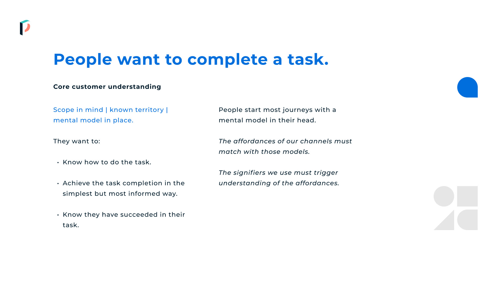
I use UX Measurement Frameworks to help keep me honest.
It's easy, especially with large scale design, to veer off track and get lost in the process and outputs. But ultimately our designs, as much as we want them to look beautiful, have jobs to do.
When re-inventing a brand identity, creating a new product line, re-thinking or iterating upon an existing design language I always start by defining and documenting what success looks like in measurable and tangible ways.
What do we want customers to do? How do we want them to feel? What emotions do we want to avoid? UX Measurement Frameworks allow us to track the value of design beyond the basic KPIs. Yes we want to increase conversion rate, but do we also want to ensure we don't erode the brand or make people feel uncomfortable?
Yes. Yes we do.

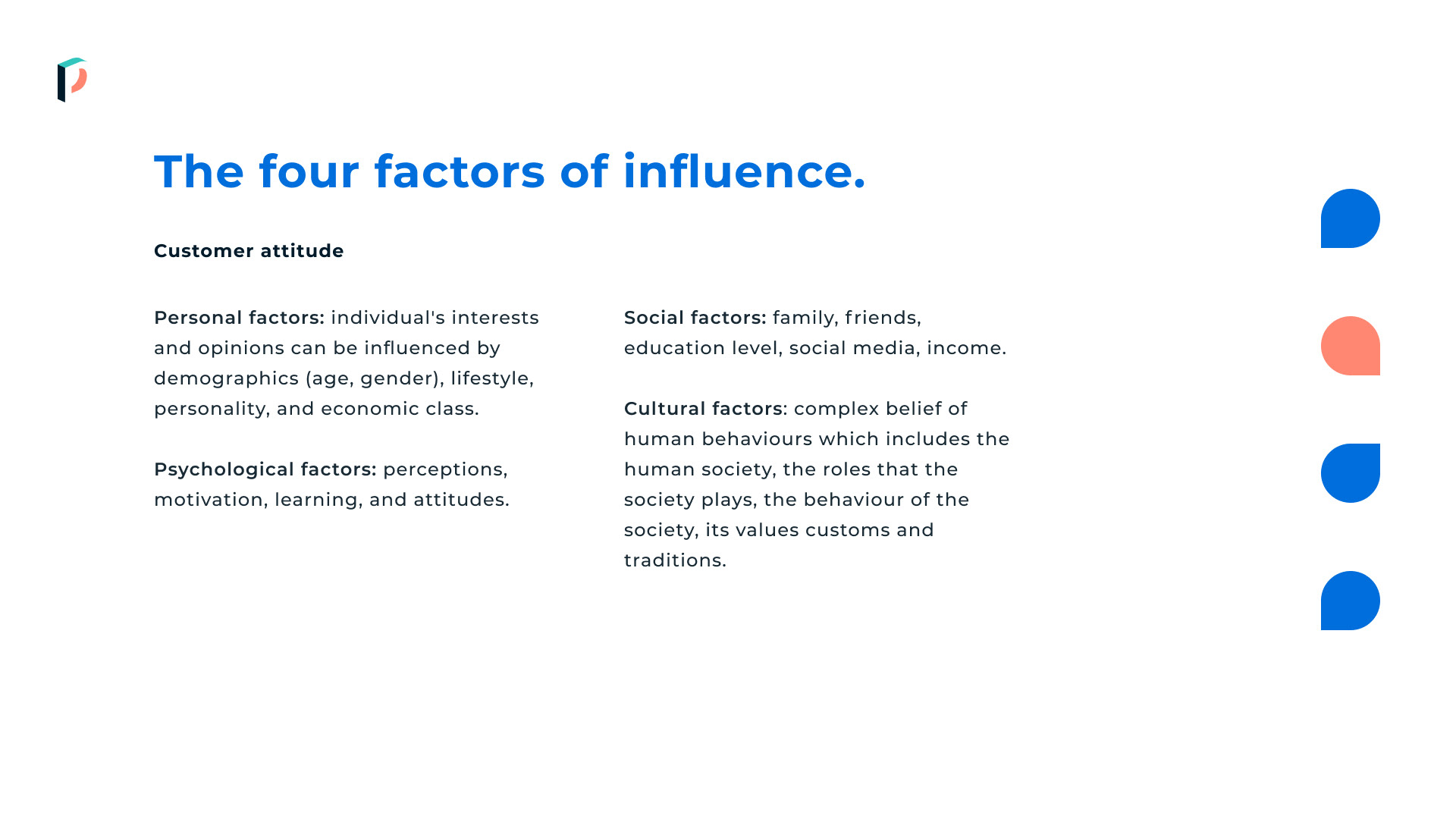
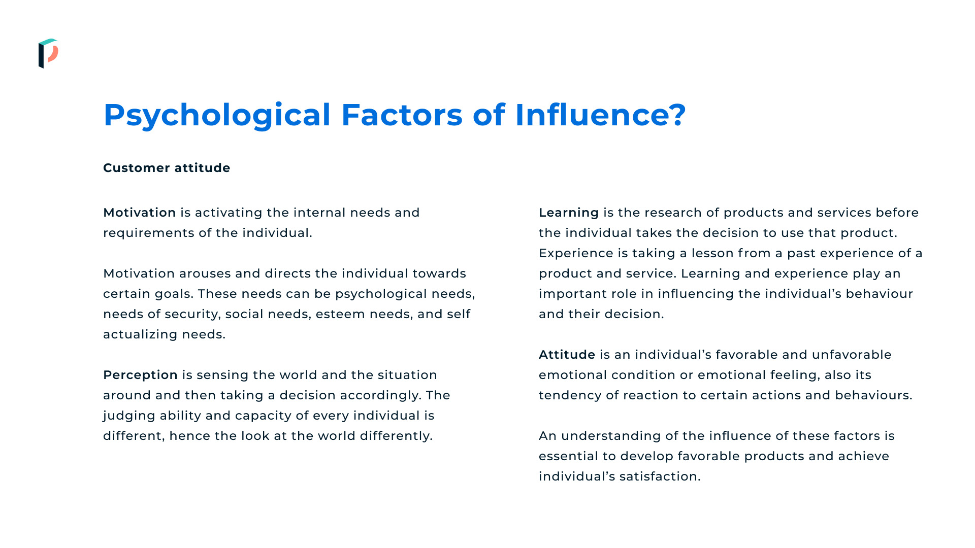
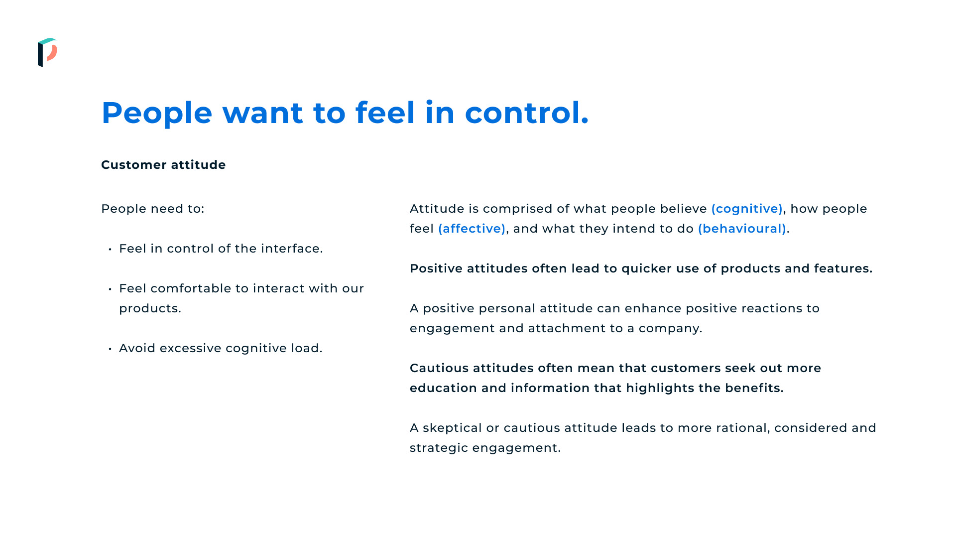


UX Measurement Frameworks are nothing new and are pretty simple to create. If you have a solid brand and existing design principles that are actively used it's just a case of attaching metrics that you can evidence against those principles.
But when you want to elevate your design above that of your competitors, or you are facing challenges getting what are seen as 'nice to have' changes made, you need to bring human emotion and behaviour into view. Make the fluffy and conceptual world of design into something tangible and un-arguable.
An example, do your designs reassure customers?
Your 'Reassurance Score' may be defined by how learnable your interfaces are, how understood your content is, how often people hesitate to complete a task and how they display that hesitation. Once you have decided the key points you'll use to measure a design principle it becomes simple to attach a pounds and pence figure to it.
When you combine customer comment and bottom line improvements and link them back to a UX Principle, it becomes harder to ignore the power of design.
A real life example
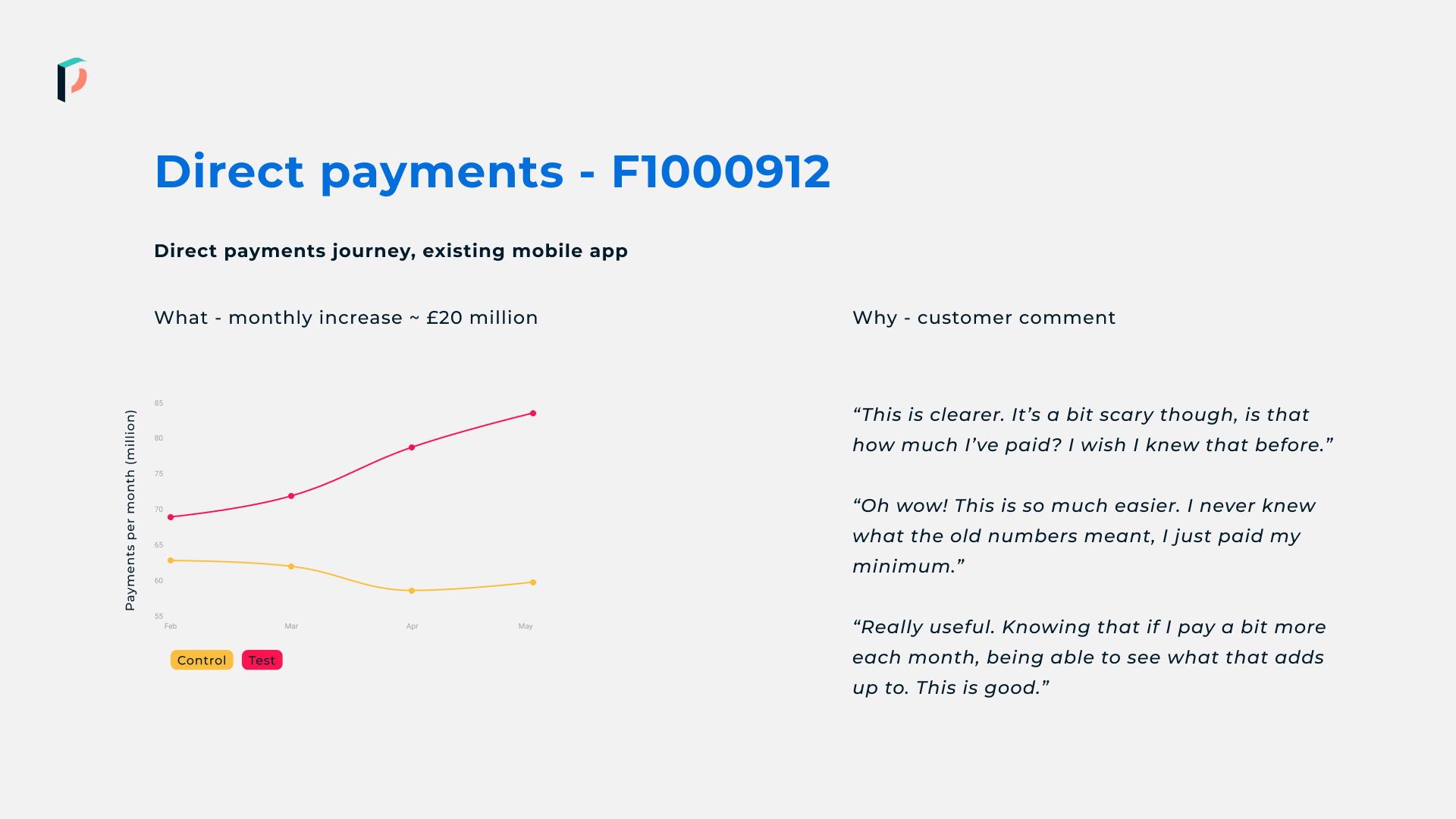
The payment journey in the Vanquis app was stagnant. The design team wondered if we could nudge people to pay off their debts faster, but not through fear and not in a way that would leave them financially exposed, would we be helping them to pay less in interest over time?
So we built a test.
And we found that by adding a single sentence in one screen we could increase monthly repayments by just over £20 million per month. That un-arguable figure, combined with customer quotes, allowed us to clearly demonstrate that two of our design principles - customers in control, and radical transparency - were not just nice ideas.
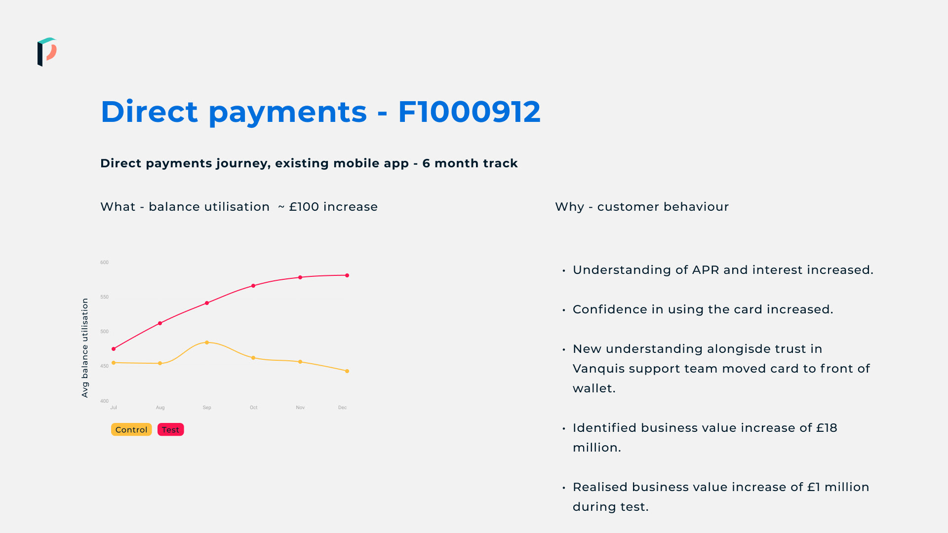
When you track changes over time the financial benefit of design becomes plain.
When we then tracked over time we could see that the repayment increases had made a direct impact on card balance growth. This makes no sense until you look at it from a behavioural psychology point of view.
- Increased transparency around interest rates led to increased understanding of how an APR works.
- Increased understanding of APR led to decreased concern over what at first appeared to be a high rate.
- Decreased concern over the rate made customers more comfortable to use the card.
- Increased comfort directly led to increased revenues.
This is the power of a UX Measure Framework. It takes concepts that many are uncomfortable with and translates it into things you can't ignore.
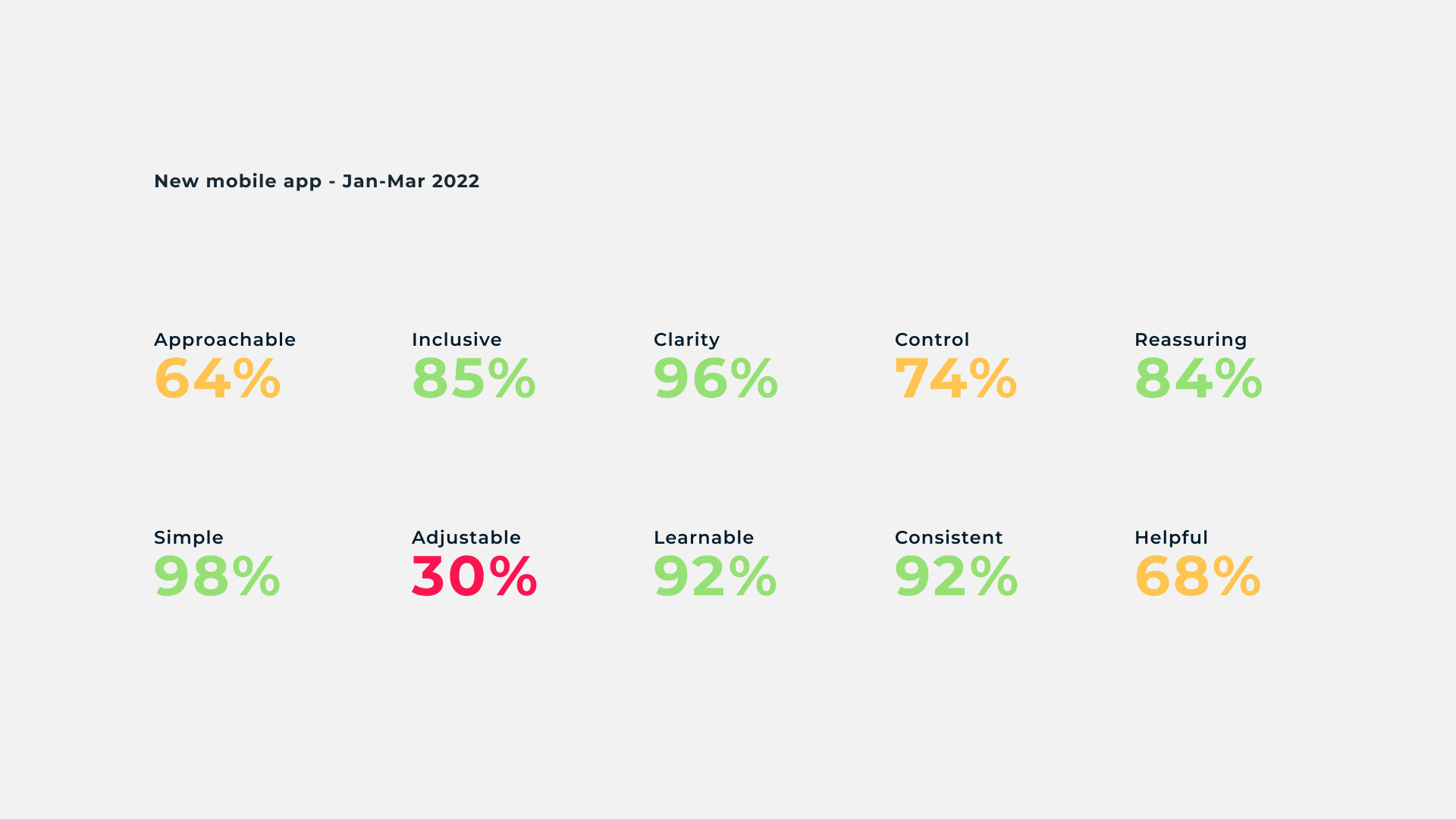
Real scores from the new Vanquis mobile app. It's clear where the team need to focus.
These frameworks are incredibly powerful if used correctly.
They enable design teams to put a value to what they've achieved. They help to put an end to unfounded and confused comments from people that have never been exposed to proper design. They help the team see the big impact of smaller changes. They help engineering and design teams to work together. And they help move design from an afterthought, they give it a place at the table.