The Royal Household project was high stakes and high stress. The challenge the site had to meet was to allow 2 editors to compete with the world's media. Any news about the Royal Household should be on this site before it hits the media. This challenge, coupled with the desire to create a site that encourages people to explore the rich history of The Royal Household, suggested a timeline approach of content quickly dubbed "the binge wall".
The brief: Design a new site for the British Monarchy, including a static code based prototype for development hand-off.
Outcomes: Award winning design delivered ahead of schedule.
My role: Creative Director.
My role: Creative Director.

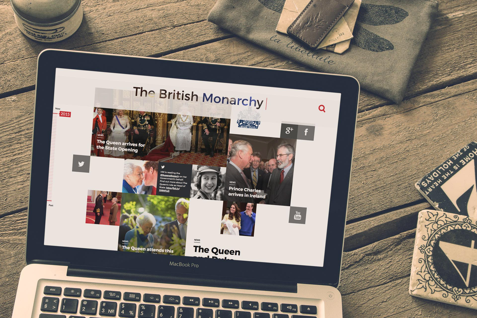
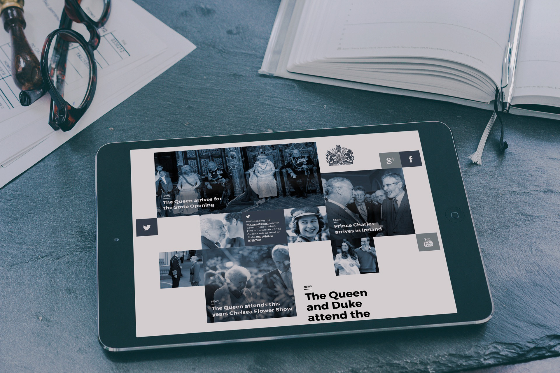
The site needed to feel welcoming and personal. This is where The Royal Household share their stories with the world, and they were keen that it felt less like a site and more like a history of... a diary of the family's work. This was for the benefit of the casual audience, as well as "the loyal Royals" - the Royal fans who come back to the site every day. These visitors wanted to be presented with something new every time they arrive, almost like a social media feed, but with an easy way to find content on a given subject.

The site also needed to present to-the-minute content on fresh stories. Writers travel with members of The Royal Household and we designed the site to promote content from these editors above other content. Specifically these editors publish from their mobile phones, able to text in new content as it happens in real time, and the design will assemble these snippets into a story in real time. This allows the loyal fanbase to follow along with a story as it happens, but also allows the editors to beat the world's media in publishing times.
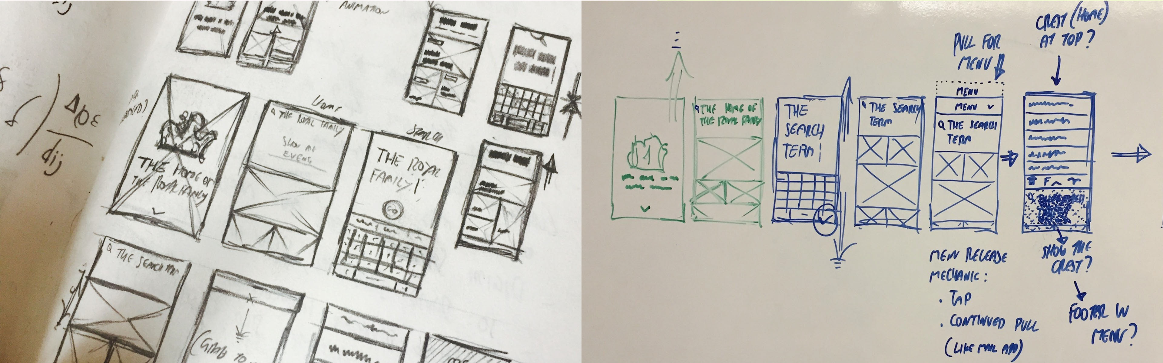
Initial thumbnail concepts and flows
Given the nature of the project, no customer testing was allowed. The site would need to launch unseen and untested, with minimal scope for changes once live. This was not ideal, especially as we were trying to create a site that was not based upon common templates. To ensure the design worked as expected we built the entire front-end as working code but without any mention of the client, and with dummy content.
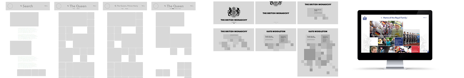
Every page on the site is built around a master grid, with stories placed upon the grid and sized based upon their relevance to the search terms. Every piece of content is richly tagged allowing people to quickly find the content they need. You can filter by person, event, country, time, date, even the colour of clothing.
Alongside the main content and day to day purpose, the site also has a "bridging mode" which needs to activate under certain circumstances such as the death of a family member. Once activated the site itself will mourn the passing of the family member, and act as a point of reference for the public and the media. At this point up to date media packs are generated and made available.