The Vanquis customer proposition was changed in 2018, with the brand identity modified in early 2019. Digital channels were not considered during this work, and so I was asked to lead on a refresh of the brand identity to include the needs of digital. This work, completed in partnership with Tall Agency (https://tall.agency/work/vanquis/) kicked off in 2020.
Given the nature of Vanquis Bank to move slowly and be extremely cautious, the new brand identity would need to work at a variety of levels. It had to clearly and obviously ladder up to our customer proposition and brand pillars, had to be flexible enough to allow for iteration and "dialling up" of the brand over time, and needed to help move us towards being a digital first bank.

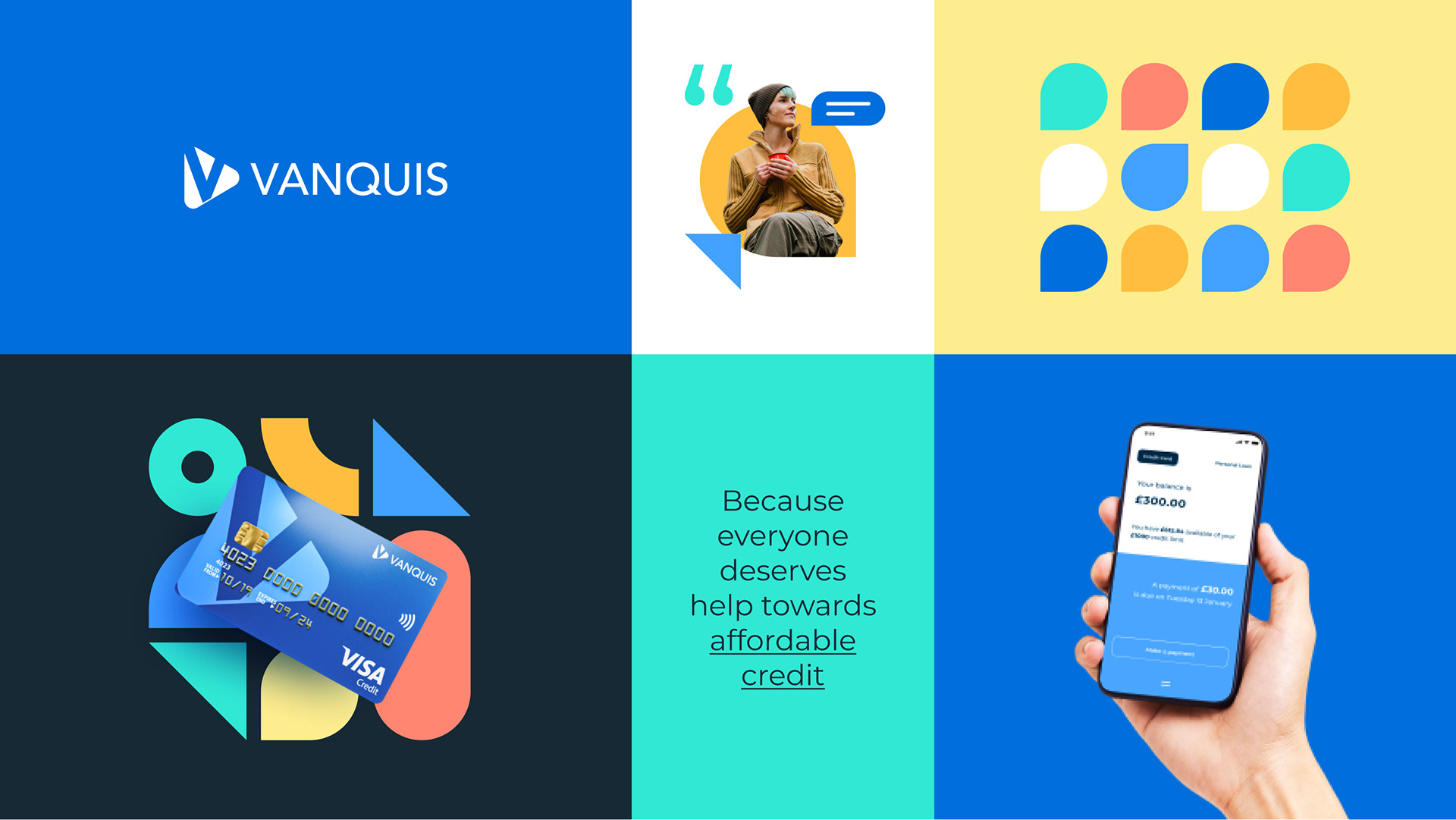
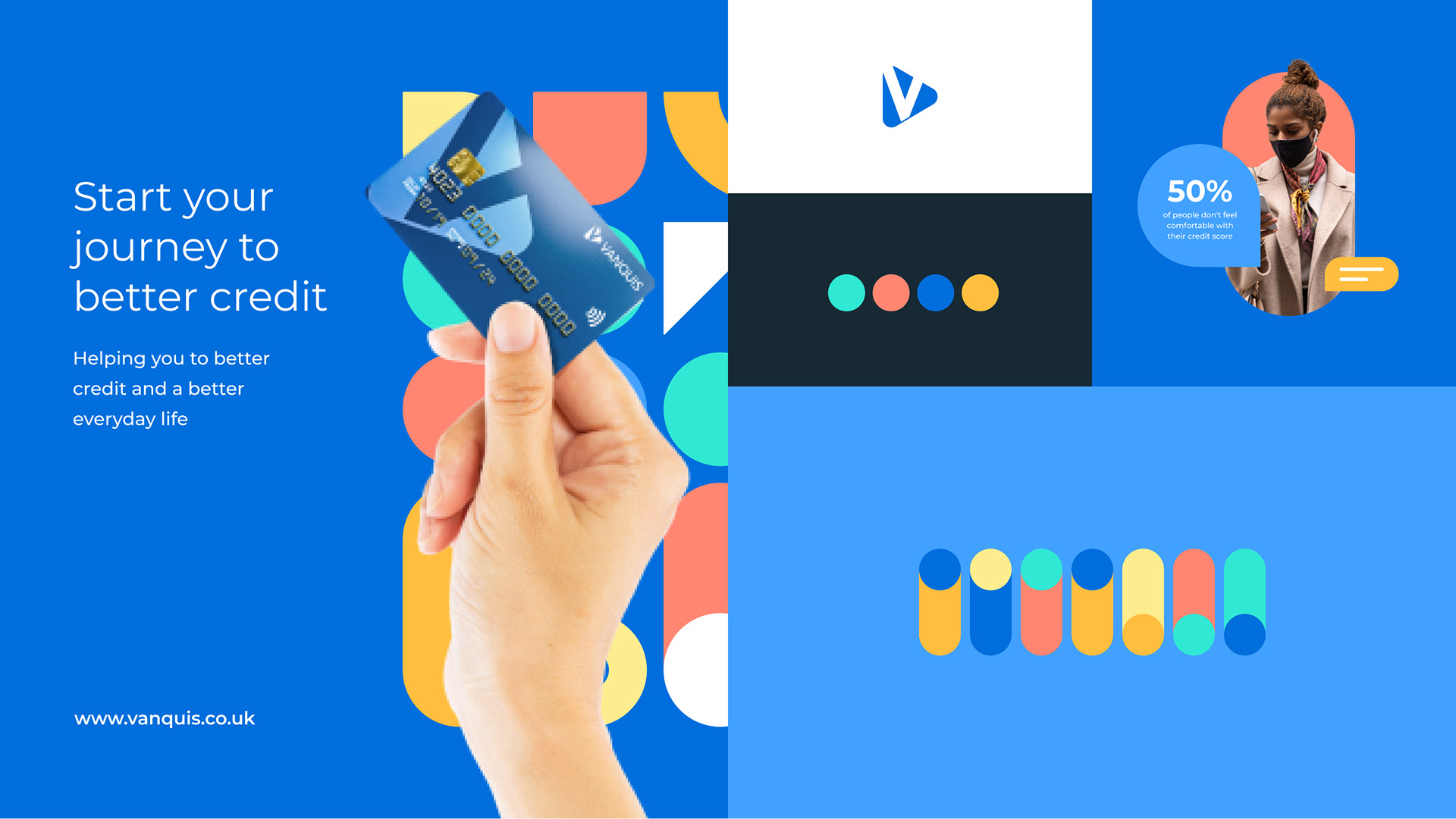
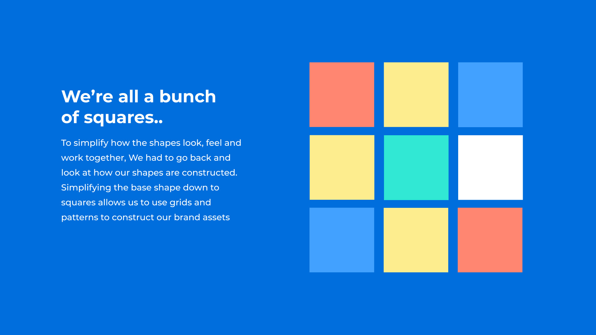
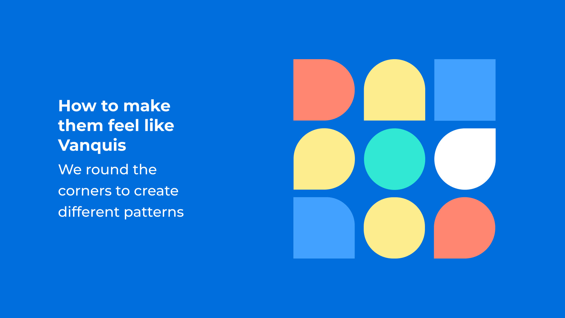
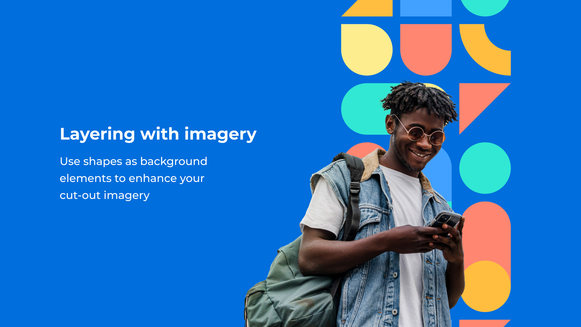
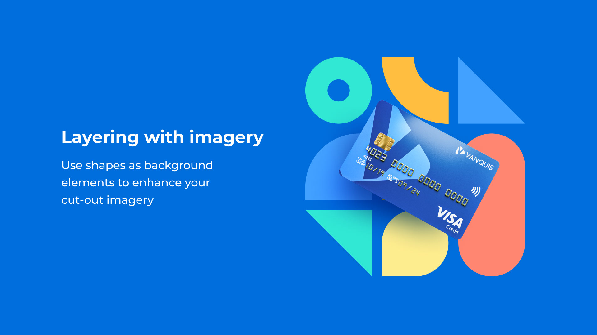
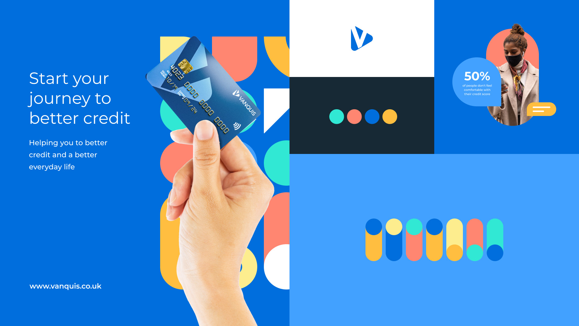
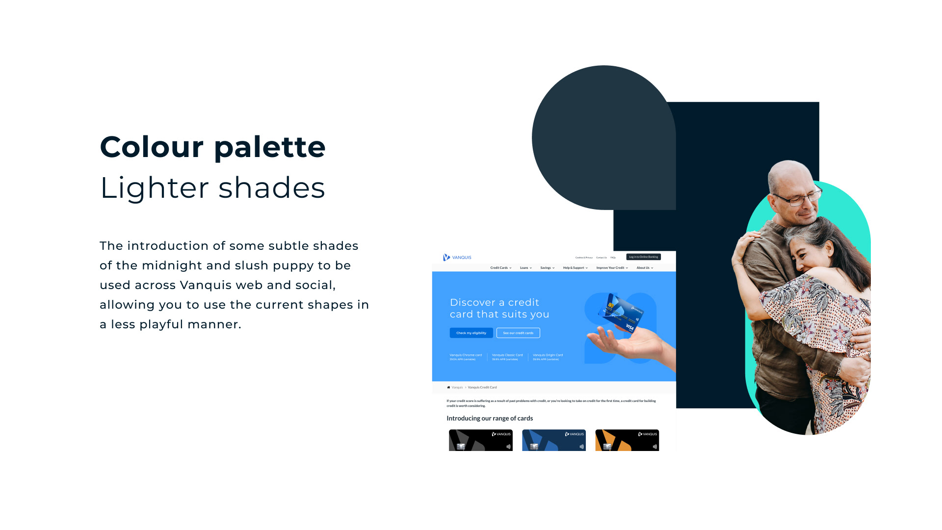
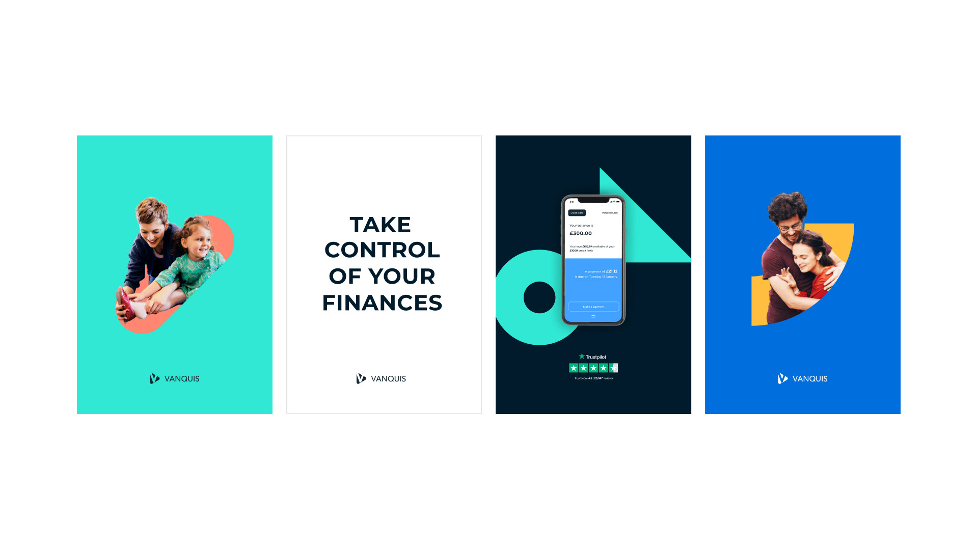
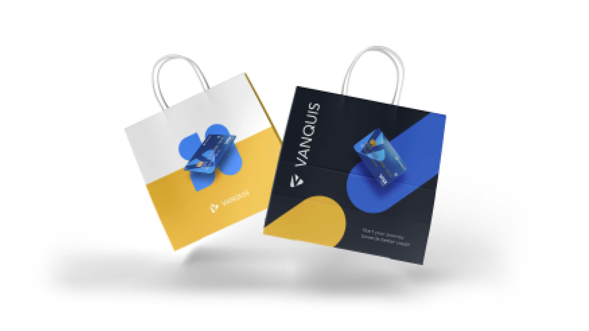
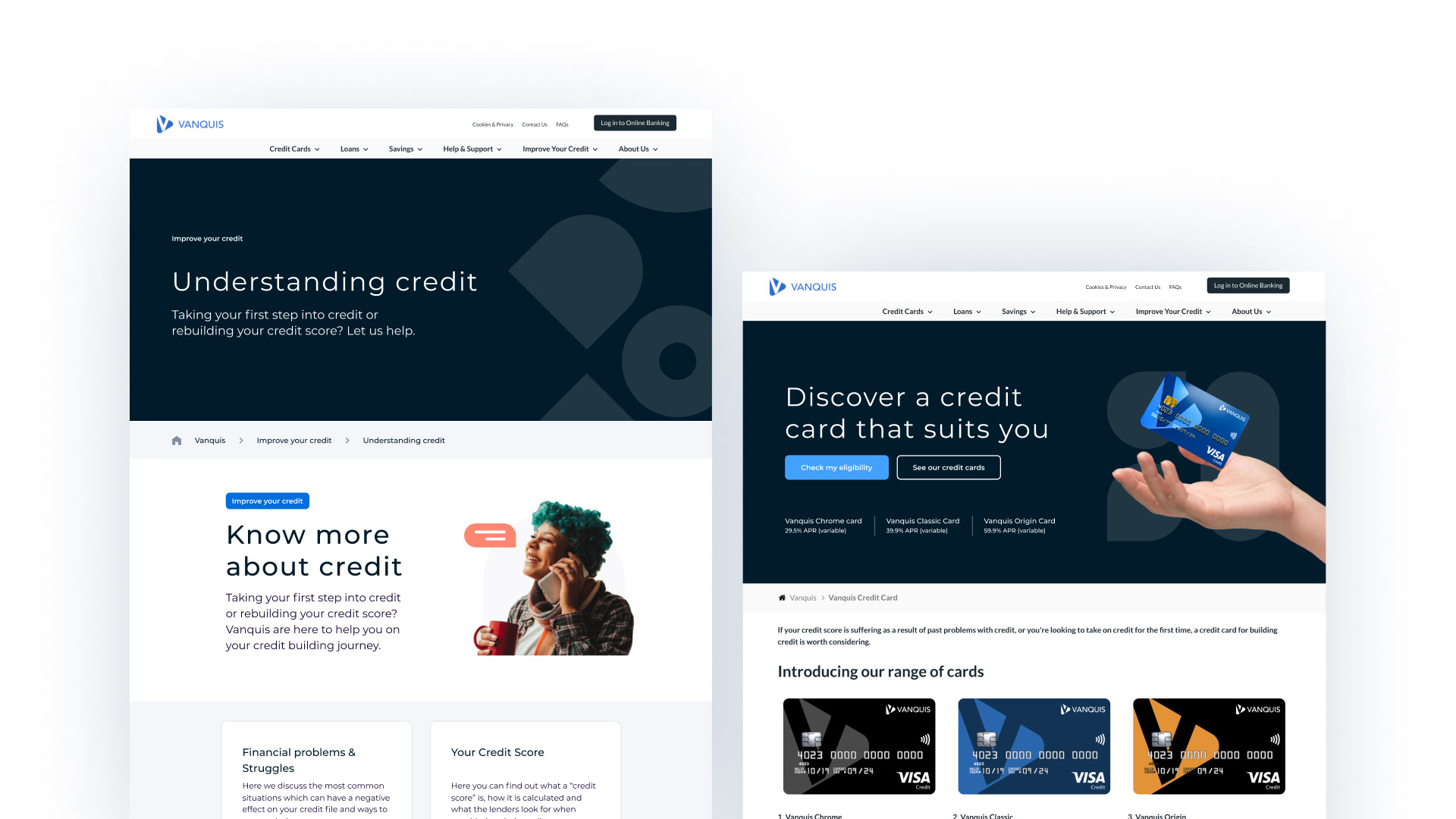
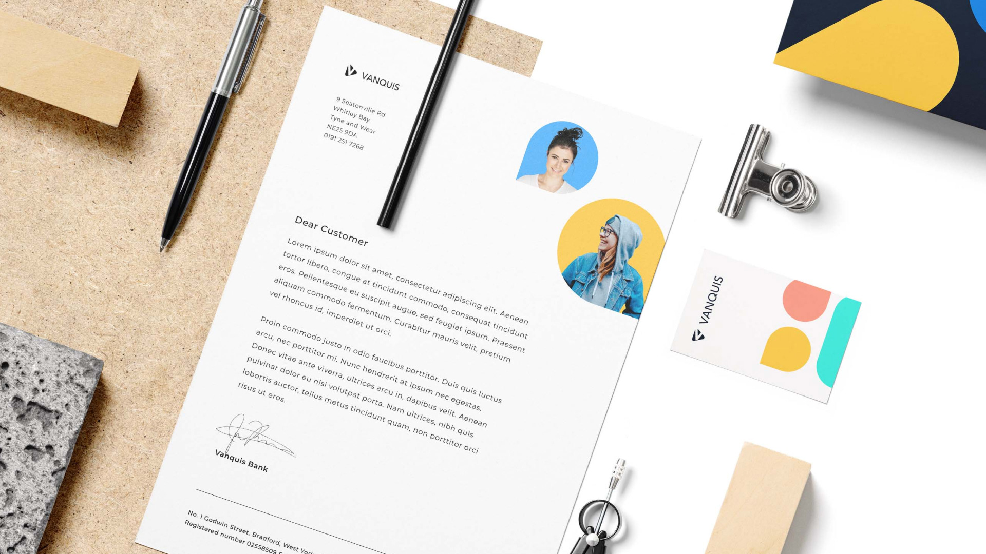
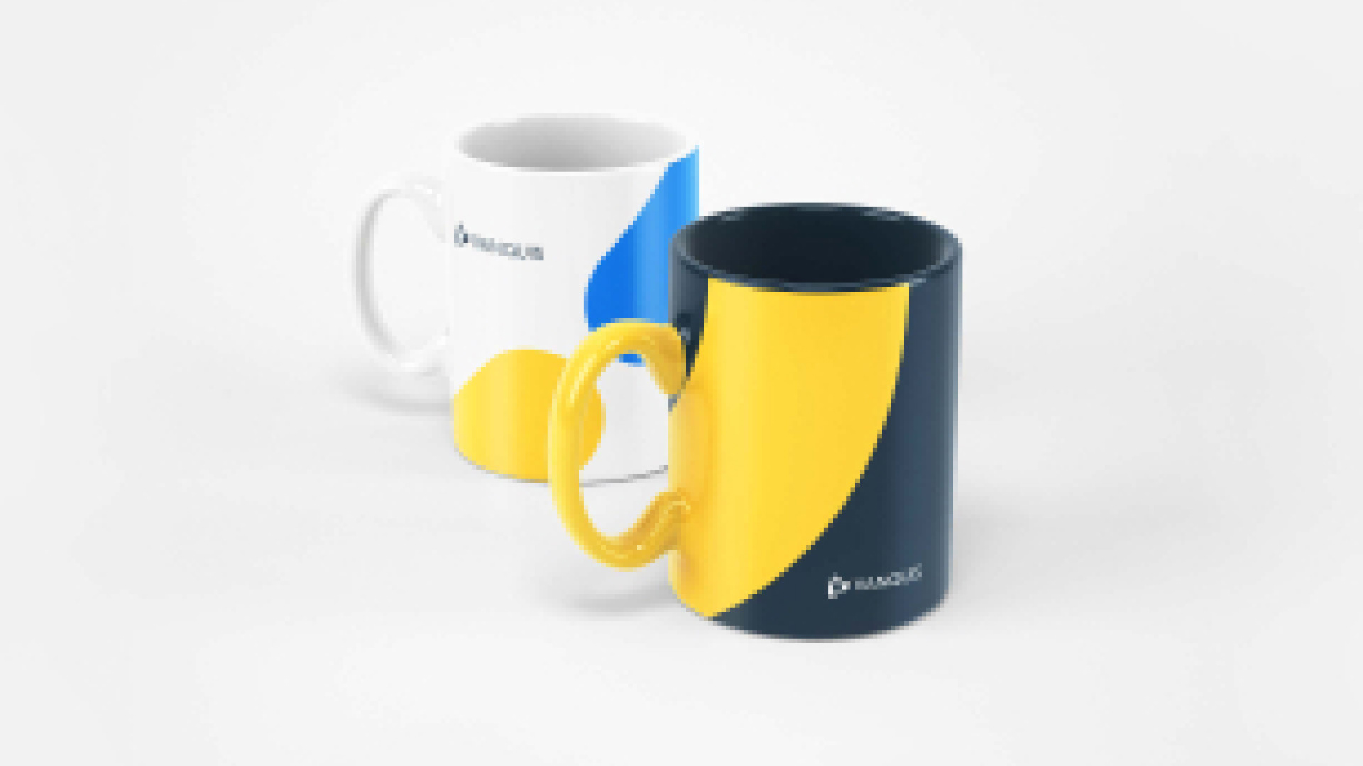
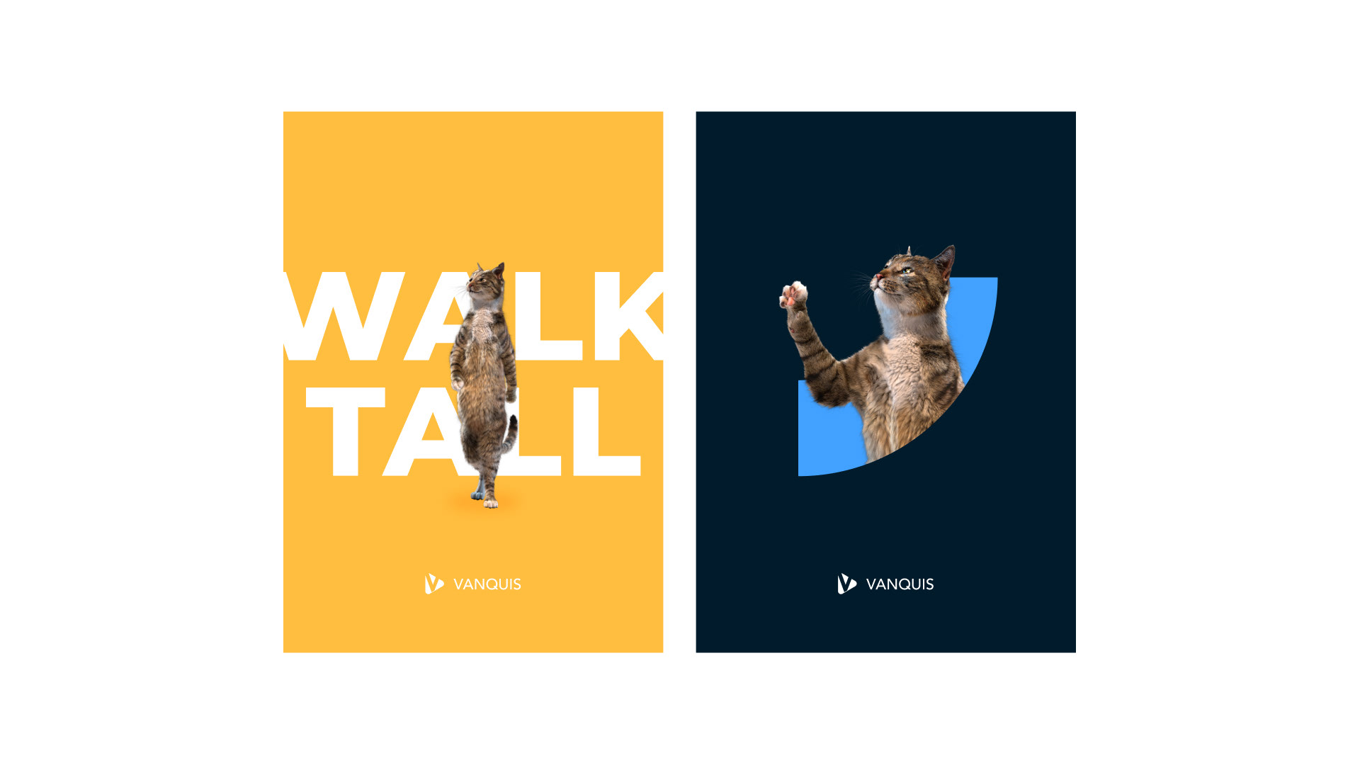
The last point, our focus on digital, meant some adaptations to our colours and shapes.
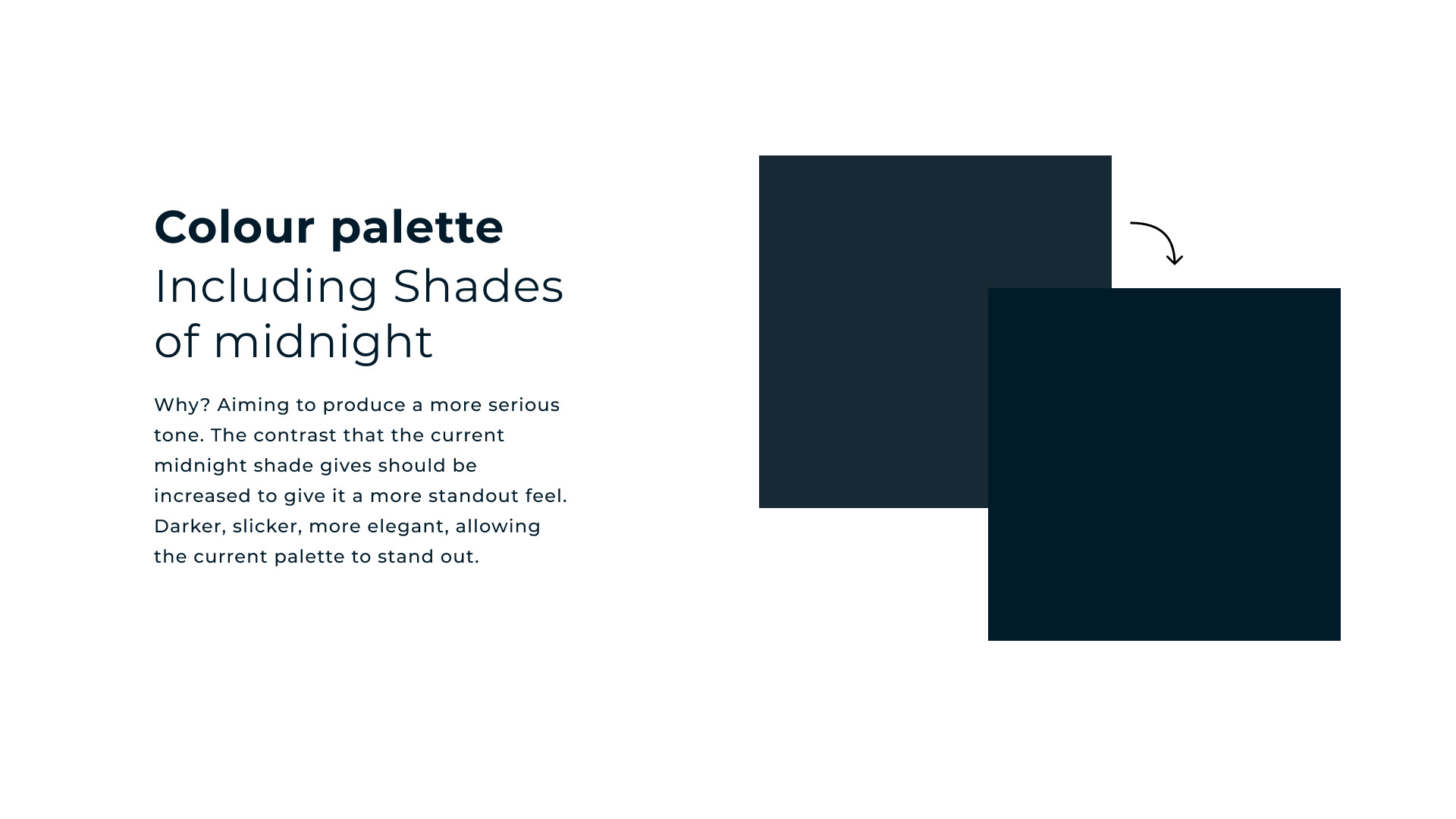
Our primary blue is an overly dominant colour, and so we created a lighter set of shades to pair with it and make it feel less corporate.
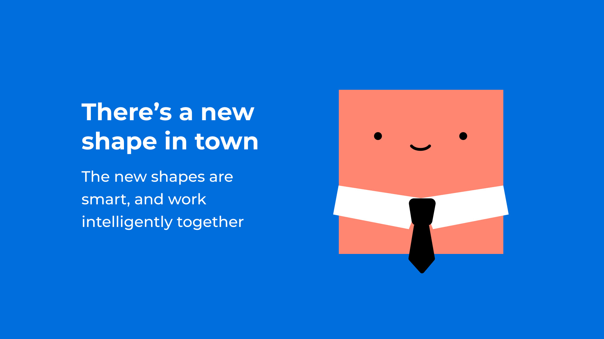
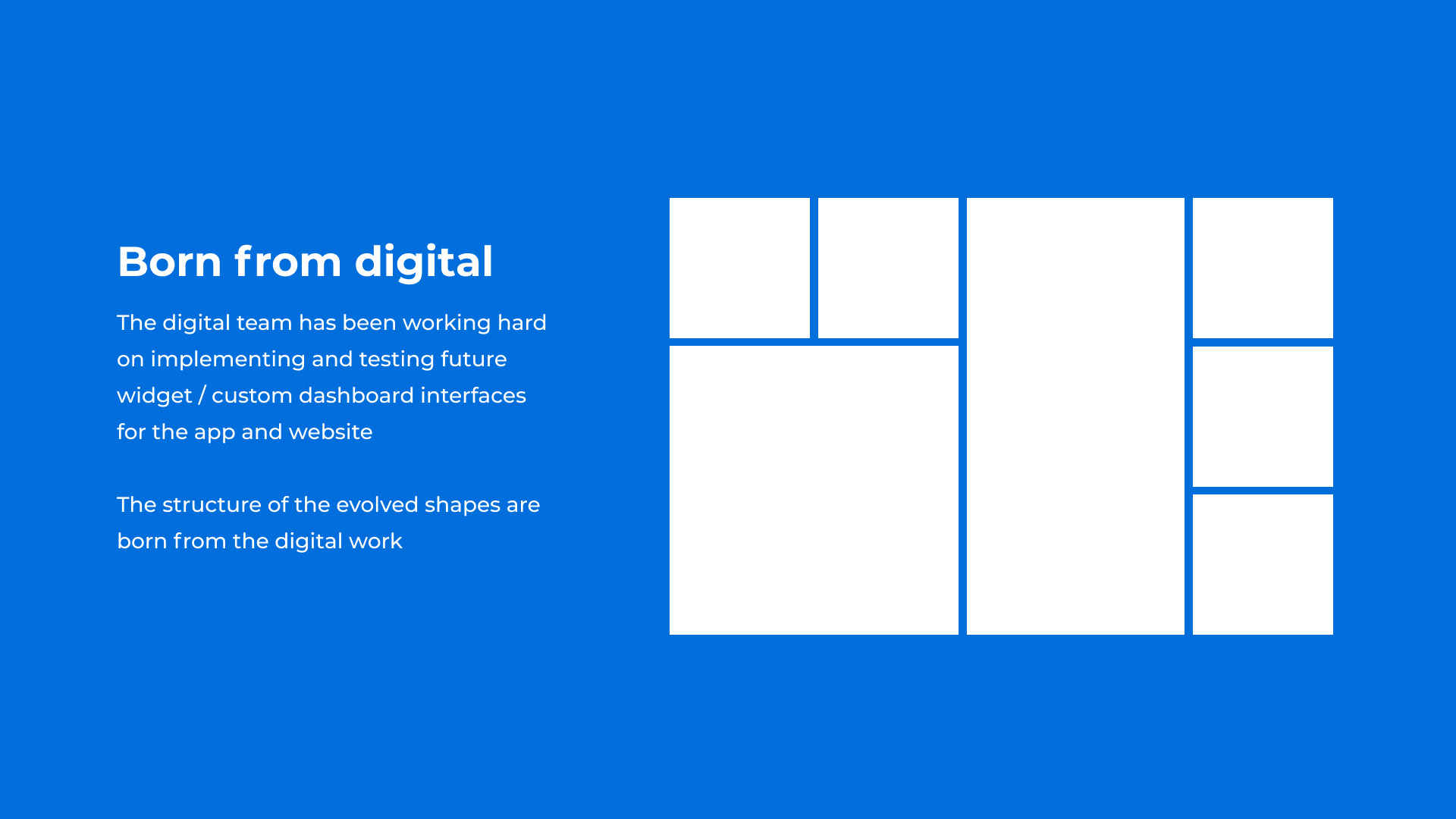
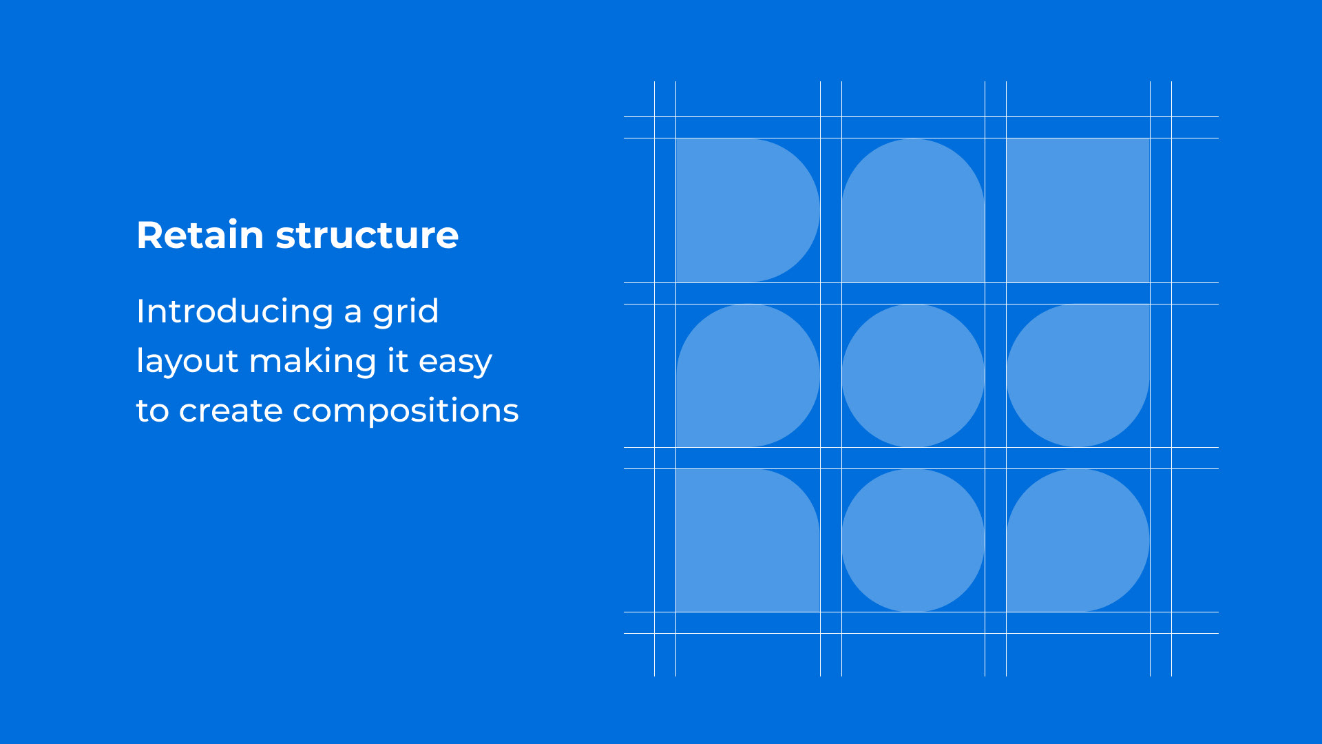
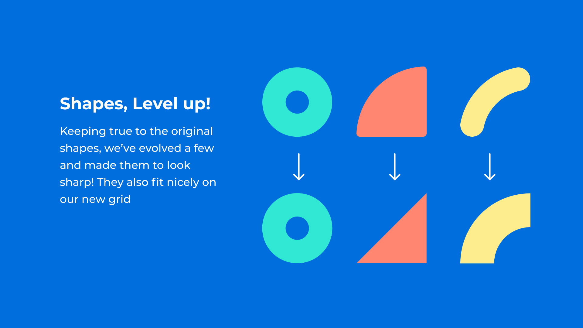
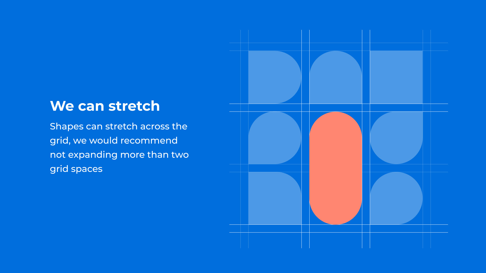
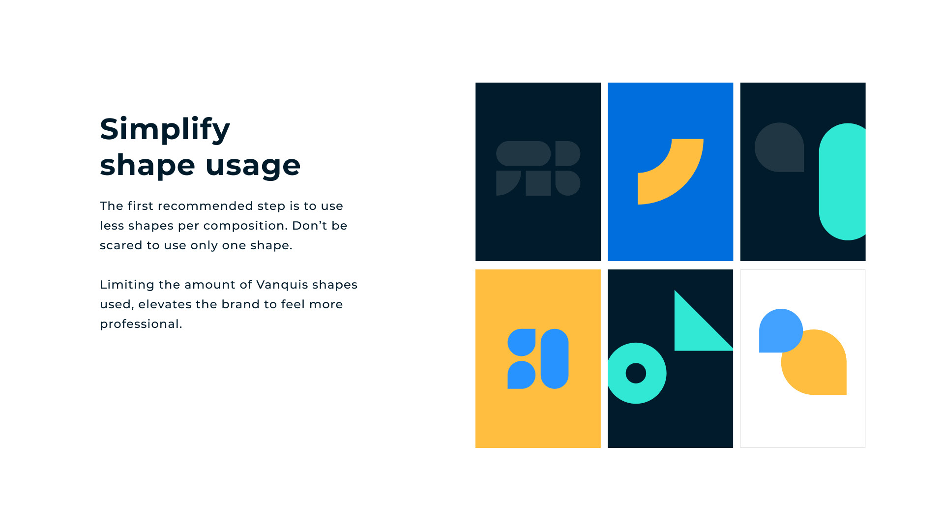
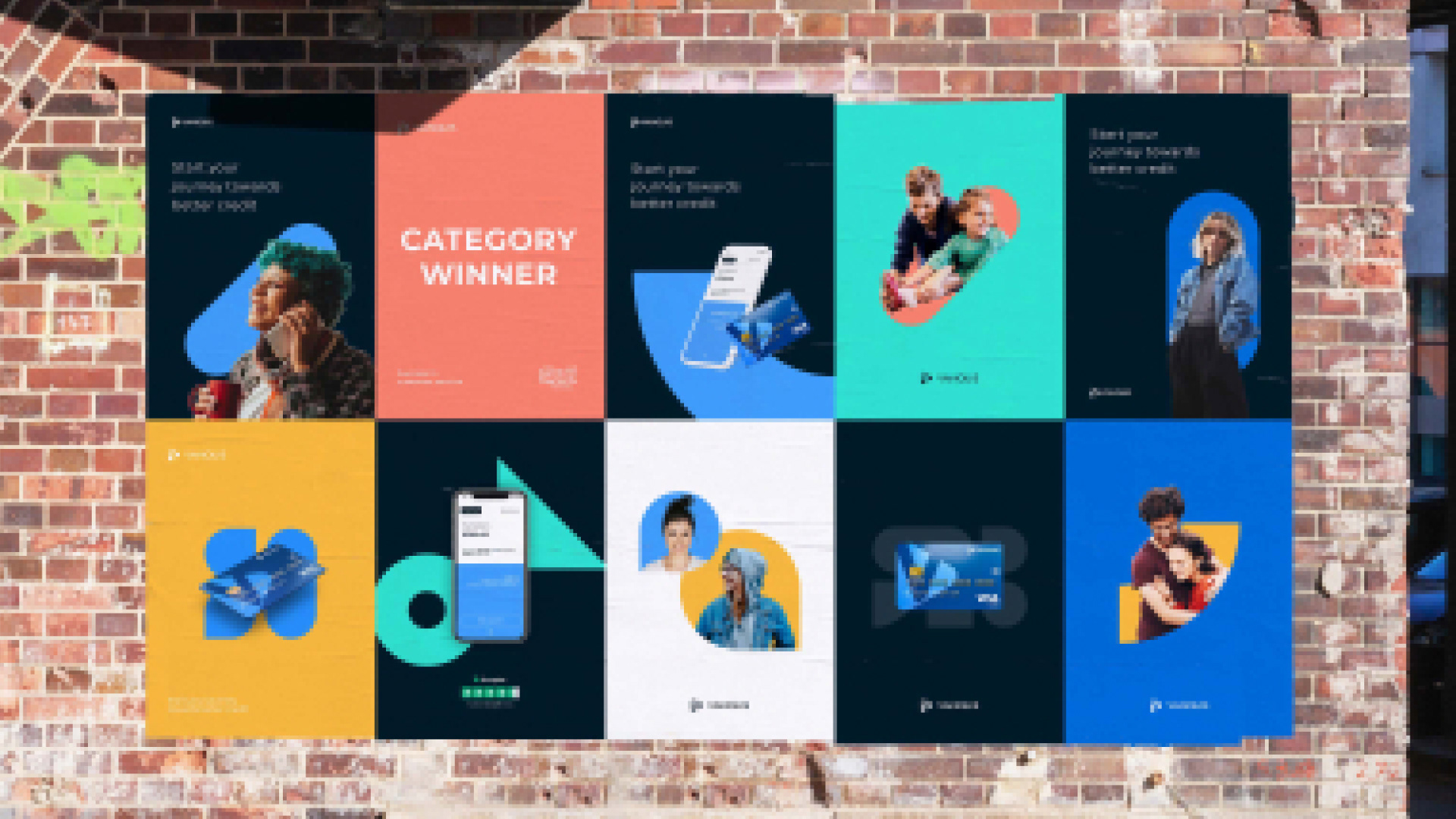
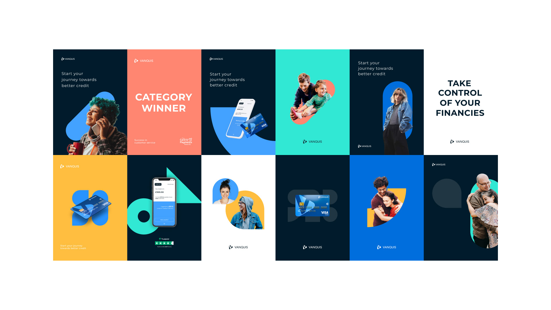
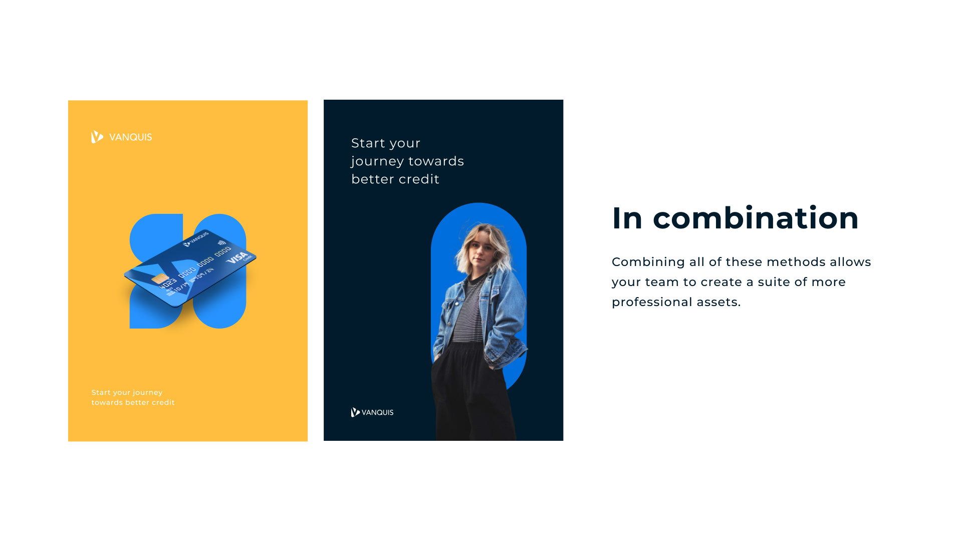
Our shapes were adapted and rebuilt so that they may work at the technical level on any digital channel. Instead of resizing at odd ratios and losing their silhouette, they now resize with ease and remain consistent in volume.
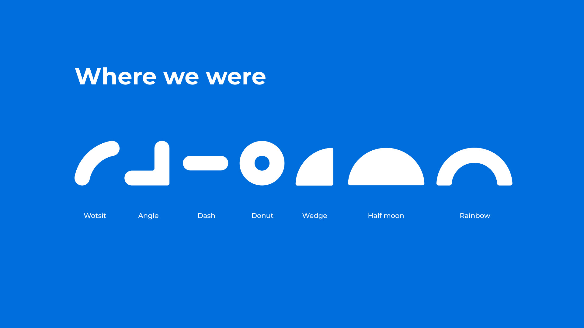
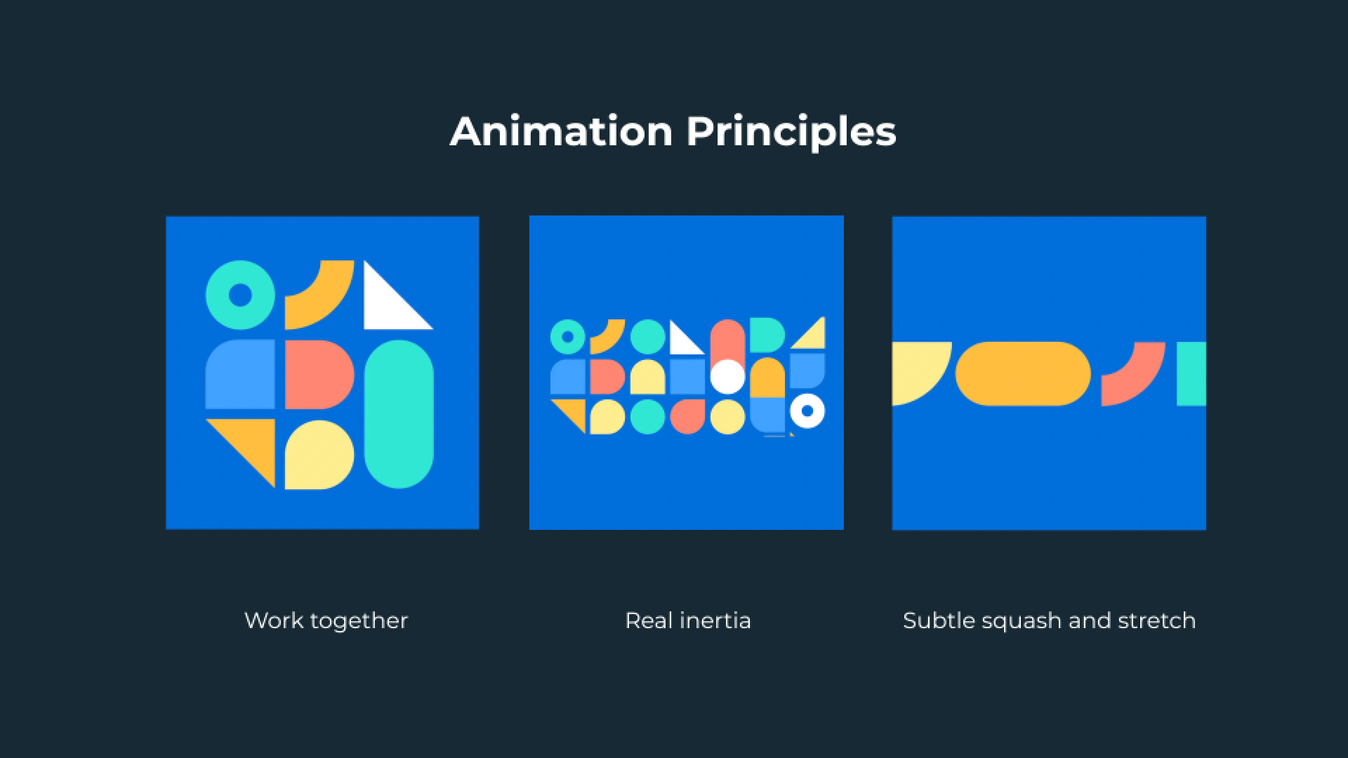
We added one more shape, we call it 'The Wotsit'. This is used to create paths and journeys, the video below gives you an idea.
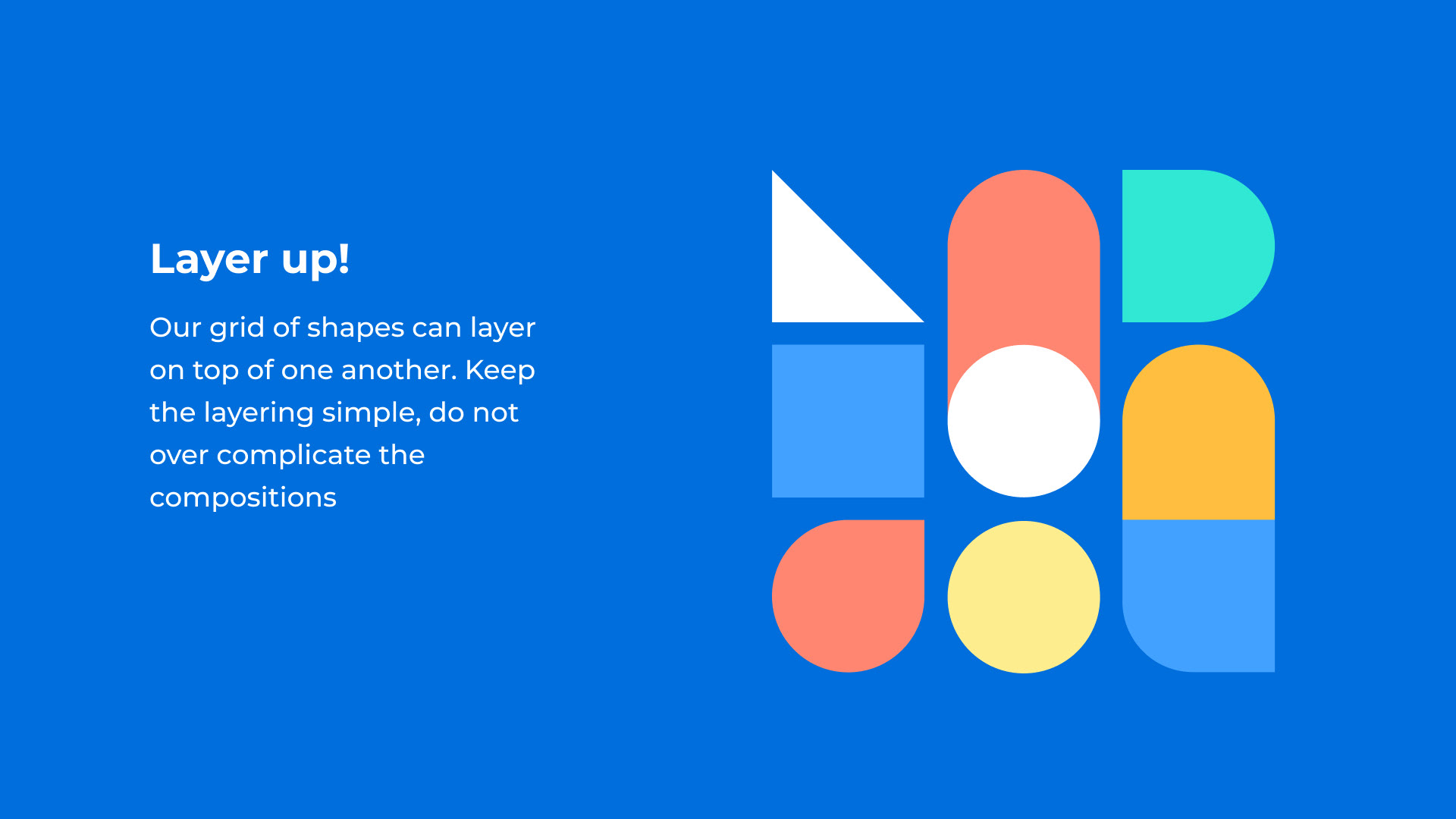
We tackled the way the shapes move and work together and created rules on motion design. The shapes have a collective personality and form clusters that help 'support' and 'lift up'.
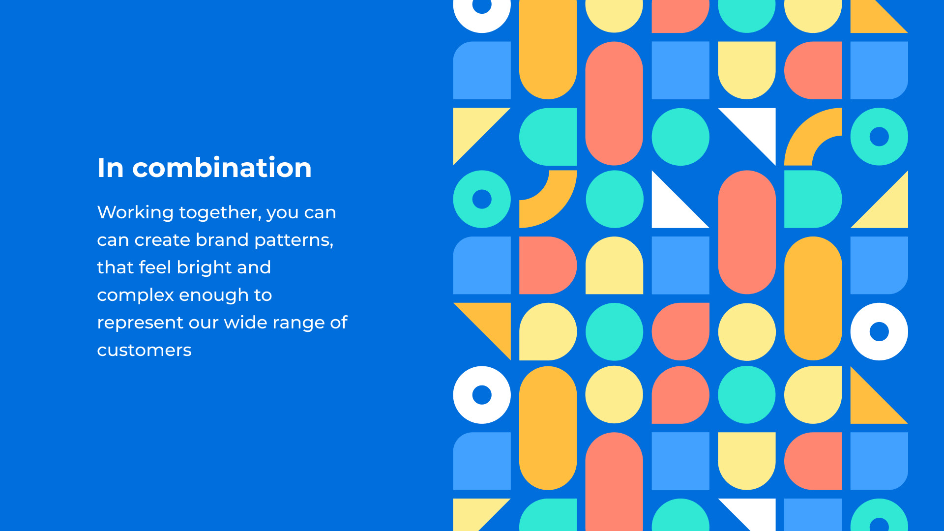
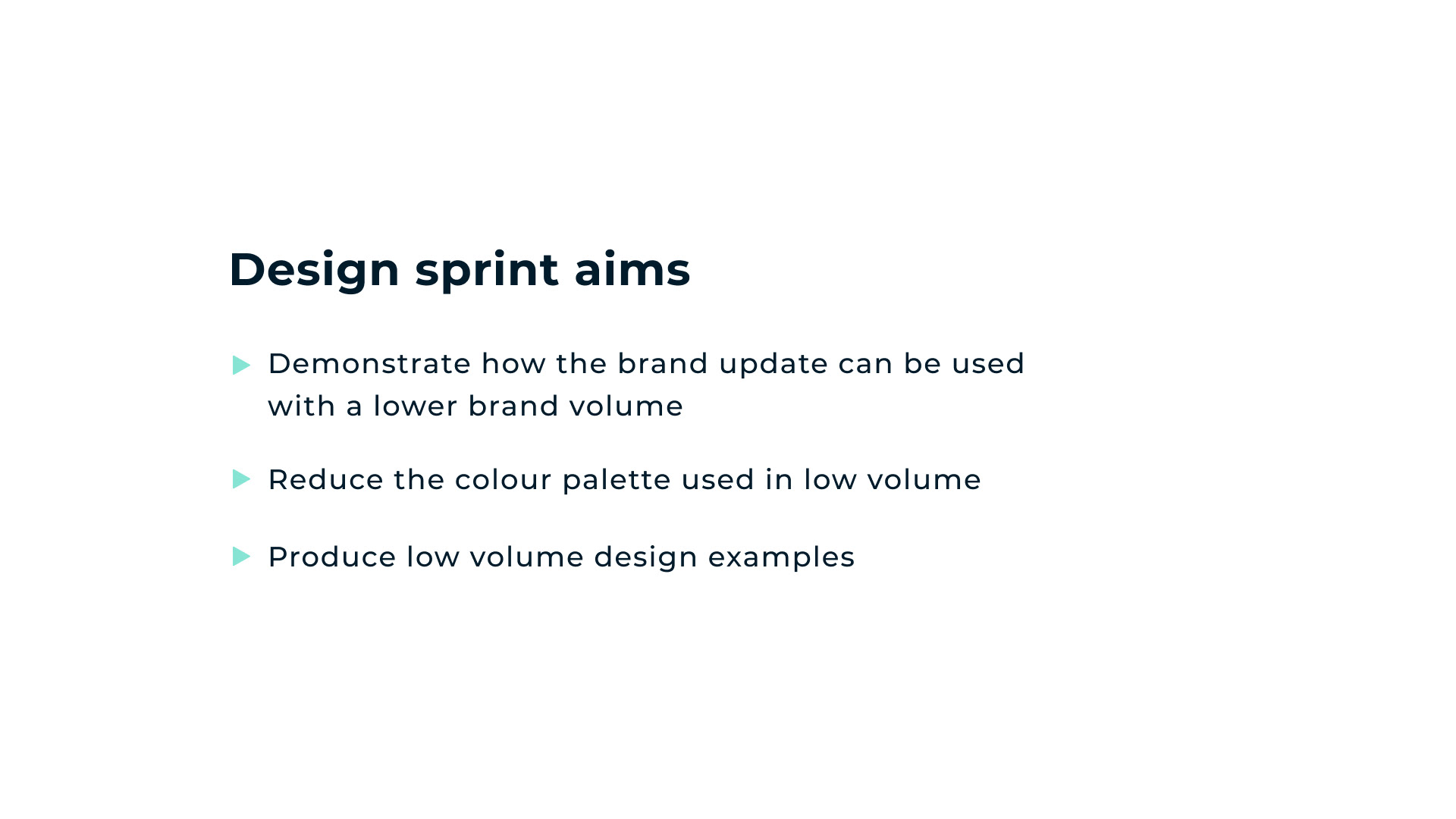
We then created levels of brand volume. As a brand we have to report back to the regulators and shareholders, we have to have exciting conversations with customers, and we have to have very difficult conversations with vulnerable customers. Our identity must work across a larger set of contexts than many other brands, and so we created the levels and rules of use.
The refreshed identity is rolling out now to customers.